
Brand Guide
Brand Foundations
Guide Rules
Every rule that follows, from logo spacing to a loan officer's email signature, has to agree with the commitments made in this section.
Brand Foundations
Guide Rules
Every rule that follows, from logo spacing to a loan officer's email signature, has to agree with the commitments made in this section.
What Thompson Kane Is
Thompson Kane & Company is a licensed direct mortgage banker headquartered in Madison, Wisconsin. It originates, underwrites, funds, and closes home loans with its own capital.
Everything else in this guide follows from that. Holding the capital keeps the decision in the building. Keeping the decision in the building is what makes a reachable loan officer possible. A reachable officer with authority is what makes a difficult file workable.
The company is never called a bank, which it is not, or a broker, which places files with outside lenders.
Who the company serves
Two groups read what Thompson Kane publishes, and they arrive in different ways.
People scouting the company. They find the site through a search, a social ad, a directory listing, or a link someone sent. Many are early: checking a rate, asking whether a program exists, or looking for a person to talk to, and plenty submit a form before they have decided anything. They have no relationship with the company yet, so the writing is the first impression.
People who become borrowers. Most arrive already pointed at Thompson Kane: sent by a real estate agent, family member, or a friend. A meaningful share of volume is borrowers coming back for a second, third, or fourth loan. They come to confirm a recommendation, and the writing has to show it was a good one.
Public copy has to serve both: enough substance for a stranger to judge the company without calling anyone, and enough evidence for a referred visitor to trust the introduction.
First-time buyers are a core constituency. The FHA, VA, USDA, and down payment assistance volume makes access lending a large part of the business.
Alternatives |
Alternatives
Options homebuyers commonly weigh against Thompson Kane
01 BANKS & CREDIT UNIONS
What borrowers find
Slow, bound by policy, and unable to work a file that falls outside the rulebook. The mortgage is one account among many.
What Thompson Kane offers instead
Thompson Kane compares favorably against them with our singular focus on home loans and willingness to work a client's file.
02 NATIONAL ONLINE LENDERS
What borrowers find
Fast quotes, scripted strangers, and billboard rates few borrowers receive.
What Thompson Kane offers instead
Against this, Thompson Kane offers one accountable person from first call to closing.
Materials may prioritize addressing banks, the more common alternative in core markets.
Materials may prioritize addressing banks, the more common alternative in core markets.
Materials may prioritize addressing banks, the more common alternative in core markets.
Mortgage lending spent two decades moving that decision away from people, into scoring models and call centers where the person a borrower reaches has no authority over the outcome. Thompson Kane exists to keep it with someone who can be reached and held to it.
A vision stated as a growth target expires the quarter it is met or missed. Being the first call holds at any size, and it names the two groups that generate the company's volume: borrowers and the agents who refer them.
Thompson Kane lends its own capital, so the people who decide on a loan are the people a borrower can reach, and the complications that send other lenders running are the ones the company takes on.
Personal means reachable people with real authority, which is a staffing commitment before it is a service one. Possible means the access work: government-backed programs, assistance stacking, the file another lender declined. Neither promises an outcome.
Thompson Kane brings the capital of an institution that funds its own loans and the accountability of a company where every borrower knows who is holding the file.
POSITIONING STATEMENT
POSITIONING STATEMENT
Thompson Kane is:
Thompson Kane is:
For
{
home buyers and homeowners who want a person accountable for their loan
for home buyers and homeowners who want a person accountable for their loan
For
{
home buyers and homeowners who want a person accountable for their loan
Who
{
would otherwise use a local bank or credit union, a national online lender, or whichever lender an agent recommended
who would otherwise use a local bank or credit union, a national online lender, or whichever lender an agent recommended
Who
{
would otherwise use a local bank or credit union, a national online lender, or whichever lender an agent recommended
Thompson Kane
{
is a licensed direct mortgage banker
Thompson Kane is a licensed direct mortgage banker
Thompson Kane
{
is a licensed direct mortgage banker
That
{
originates, underwrites, funds, and closes loans with its own capital
that originates, underwrites, funds, and closes loans with its own capital
That
{
originates, underwrites, funds, and closes loans with its own capital
Unlike brokers
{
who place files with outside lenders, and institutions where the decision is made by someone the borrower never speaks to
unlike brokers who place files with outside lenders, and institutions where the decision is made by someone the borrower never speaks to
Unlike brokers
{
who place files with outside lenders, and institutions where the decision is made by someone the borrower never speaks to
Because
{
holding the capital and the decision in the same building is what makes an accountable, reachable loan officer possible
because holding the capital and the decision in the same building is what makes an accountable, reachable loan officer possible
Because
{
holding the capital and the decision in the same building is what makes an accountable, reachable loan officer possible
RULES OUT
Deferring a borrower's question to an outside party, or making a commitment the company cannot keep.
RULES OUT
A notice in the mail being the first time a borrower learns something the company already knew.
RULES OUT
Using guideline rigidity as the explanation for a decline, or treating extra effort on a file as a promise of approval.
RULES OUT
Deferring a borrower's question to an outside party, or making a commitment the company cannot keep.
RULES OUT
A notice in the mail being the first time a borrower learns something the company already knew.
RULES OUT
Using guideline rigidity as the explanation for a decline, or treating extra effort on a file as a promise of approval.
These statements set what Thompson Kane's marketing is allowed to claim.
The tone of voice standards that follow set how it is said.
These statements set what Thompson Kane's marketing is allowed to claim. The tone of voice standards that follow set how it is said.
These statements set what Thompson Kane's marketing is allowed to claim.
The tone of voice standards that follow set how it is said.
Our Tone of Voice Is:
Why it Matters
Most borrowers meet Thompson Kane in writing before they meet anyone here. Whatever the copy does, the company is understood to do: explain or obscure, volunteer the hard part or bury it. The rules in this section exist so the writing behaves the way the company behaves. They follow from the mission rather than decorating it.
Clear
We say it plainly, but we never oversimplify.
We say it plainly, but we never oversimplify.
Measured
We say what we can do, but we never guarantee an outcome without verifiable documentation.
We say what we can do, but we never guarantee an outcome without verifiable documentation.
We say what we can do, but we never guarantee an outcome without verifiable documentation.
Candid
We don't disguise the bad news, but we never dramatize it.
We don't disguise the bad news, but we never dramatize it.
We don't disguise the bad news, but we never dramatize it.

How this voice is defined
Most brand guides define voice with adjectives. Friendly, professional, trustworthy, approachable. Every lender in the country claims all four, and none of them tell a writer what to put on the page.
Thompson Kane's voice is defined instead by specific practices we follow and claims we refuse to make. A writer can follow these. An editor can enforce them. That is the whole point.

What we do
Explain the reason behind every rule. A rule stated without its reason reads as bureaucracy. With the reason attached, the same rule reads as expertise. The site never says rates are unavailable. It says no advertised number can describe a particular loan, then explains what a rate actually depends on. The explanation turns a refusal into a service.
Say the uncomfortable part first, and say it in the right place. Servicing transfers, rate movement, and escrow changes that impact a payment are common borrower experiences. Where it goes matters as much as whether it gets said. Hard subjects belong in body copy and FAQs, in plain language, not framed to suggest a borrower should feel fine about something borrowers reasonably dislike. The servicing answer opens with "Possibly, yes," names what will change, then names what cannot.
Stop selling once the point is made. No closing flourish, no final paragraph that restates the preceding four. When a section has delivered its information, its work is done.
Earns every claim with a specific. A number, a mechanism, or a borrower's own words. The test is portability: if a sentence could be pasted onto a competitor's site without becoming false, it is not worth publishing. "We close on time, every time" fails this test twice over, as an unverifiable absolute and as a line any lender could claim, "We protect your closing date" names the mechanism instead.
What to ask when a line sounds generic
Generic writing is what fills the space where a fact should be. When a line could have come from any lender, the useful question is not which word is weak. It is what fact the sentence was standing in for, and whether we have that fact. "Your down payment may be smaller than you think" needs to be followed with the "why" and the "how". The fact underneath was that 20% is a convention rather than a requirement. Saying that plainly is where our content's value lies.
What we never write
Vague reassurance. "More than most people expect," "smaller than you think," "than most borrowers realize." This shows up whenever a sentence's only job is comfort and we have no fact to provide it. The fix is never a synonym. It is the missing fact.
The false contrast. "Not just a lender, a partner."
Lists of three. "Fast, transparent, and personal."
Questions we ask ourselves. A heading like "Why choose Thompson Kane?" A borrower's real question, answered with evidence, is a different thing and is encouraged.
The either/or opener. "Whether you're a first-time buyer or a seasoned investor."
Industry filler. Seamless, journey, navigate as a metaphor, stress-free, peace of mind, every step of the way, tailored, dream home, concierge-level, and competitive rates with nothing behind it.
Intensifiers. "Extremely reliable" is weaker than "reliable." The specific next to it does the work, and the intensifier waters it down.
The imaginary employee. "A loan officer who knows where to look" describes someone hypothetical. "The loan officer can check" commits the company.
Guarantees. No promise of approval, rate, or closing timeline, in any form.

Two rules with no exceptions
Practice is not policy. Loan officers work differently from one another, and rate-lock timing is the clearest case: one officer locks at application, another rarely does, and both are defensible. Public materials describe the option and send the borrower to their own officer rather than publishing one person's habit as company method. A borrower who reads one thing on the website and hears another on the phone has been misled by Thompson Kane, not by the officer.
Practice is not policy. Loan officers work differently from one another, and rate-lock timing is the clearest case: one officer locks at application, another rarely does, and both are defensible. Public materials describe the option and send the borrower to their own officer rather than publishing one person's habit as company method. A borrower who reads one thing on the website and hears another on the phone has been misled by Thompson Kane, not by the officer.
Borrower words are never edited. Reviews run as written, including their punctuation, their em dashes, and their typos. A quote may be shortened using only the reviewer's own words, and what remains has to end on a complete thought. Display names run as the reviewer wrote them. The only one we replace is a placeholder the platform generated.
Borrower words are never edited. Reviews run as written, including their punctuation, their em dashes, and their typos. A quote may be shortened using only the reviewer's own words, and what remains has to end on a complete thought. Display names run as the reviewer wrote them. The only one we replace is a placeholder the platform generated.
Two rules with no exceptions
Practice is not policy. Loan officers work differently from one another, and rate-lock timing is the clearest case: one officer locks at application, another rarely does, and both are defensible. Public materials describe the option and send the borrower to their own officer rather than publishing one person's habit as company method. A borrower who reads one thing on the website and hears another on the phone has been misled by Thompson Kane, not by the officer.
Borrower words are never edited. Reviews run as written, including their punctuation, their em dashes, and their typos. A quote may be shortened using only the reviewer's own words, and what remains has to end on a complete thought. Display names run as the reviewer wrote them. The only one we replace is a placeholder the platform generated.
How it should sound
Authority without volume.
Short sentences are fine and often better. Paragraph lengths should vary, because paragraphs of identical length read as machine-made. A ban on hyperbole and an emphasis on pragmatism and integrity set the stage for a friendly while serious voice of authority.
Authority without volume.
Short sentences are fine and often better. Paragraph lengths should vary, because paragraphs of identical length read as machine-made. A ban on hyperbole and an emphasis on pragmatism and integrity set the stage for a friendly while serious voice of authority.
Authority without volume.
Short sentences are fine and often better. Paragraph lengths should vary, because paragraphs of identical length read as machine-made. A ban on hyperbole and an emphasis on pragmatism and integrity set the stage for a friendly while serious voice of authority.
Hyperbole is never used.
Pragmatism and candor take its place. That is what keeps the voice friendly without being casual and serious without being cold.
Hyperbole is never used.
Pragmatism and candor take its place. That is what keeps the voice friendly without being casual and serious without being cold.
Hyperbole is never used.
Pragmatism and candor take its place. That is what keeps the voice friendly without being casual and serious without being cold.
Public copy speaks to the borrower as "you".
This guide does not, because the people reading it are the ones writing that copy. When we communicate to our borrowers, we provide a personal, direct conversation.
Public copy speaks to the borrower as "you".
This guide does not, because the people reading it are the ones writing that copy. When we communicate to our borrowers, we provide a personal, direct conversation.
Our logo lockup combines the Gotham-based wordmark with our "TK" letterform badge. Modern yet accessible, it recognizes no boundaries between the enthusiast and the creator, or between an idea and its realization. It’s more than just a logo, it’s an invitation to create without limits.
Our logo lockup combines the Gotham-based wordmark with our "TK" letterform badge. Modern yet accessible, it recognizes no boundaries between the enthusiast and the creator, or between an idea and its realization. It’s more than just a logo, it’s an invitation to create without limits.
Logos
Design Notes
The symbol is built as a puzzle, and it works on two levels. As a structure, the strokes of the T and the K divide the disc into blue fragments that lock together in exact order; shift one and the composition collapses. As a letterform, it takes a moment to resolve, and the delay is deliberate: a mark that gives itself up at a glance is forgotten as quickly. This mark holds its complexity in clean order, the same discipline a complicated loan demands. The disc closes the composition into a seal, the impression left by whoever answers for a document, and it gives the monogram its authority. The monogram itself is the traditional signature of bespoke work, the mark a craftsman puts on something made for one client, and it commits the company to that standard on every loan. The wordmark holds to the same standard. Its modified letterforms cannot be typed into existence in a stock font. The open letterspacing comes from inscriptional lettering, where generous space marks words meant to last, and it slows the read to a measured pace, the typographic equivalent of a lowered voice. The palette is the least conventional decision in the system. Regional lenders draw from a short list of colors borrowed from banking: navy or royal blue, fire-engine red, forest green. Thompson Kane’s light, saturated blue sits outside that list, memorable on a yard sign and warm in an inbox. The wordmark’s neutral grey, with the cool cast of brushed metal, leaves the blue to carry recognition alone. One color, used with restraint, reads as confidence.
Logo Lockup - Horizontal
Wordmark
Wordmark


Symbol
Clearspace & Minimal size
Spacing guide
A mark needs room to be read. Crowd it with type or another company’s logo and it gets absorbed into the layout around it. The empty field around the logo belongs to the logo, the way a rest belongs to the music, and it does the same work as the open letterspacing in the wordmark: quiet around a name reads as confidence. Clearspace is measured in units taken from the mark itself, so the rule holds at any scale, from a business card to the side of a building. Minimum sizes protect the details that carry the meaning. Below them, the white cuts between the fragments fill in until the T and the K blur into a dot, and the wordmark’s open spacing collapses into a grey line. For a browser tab, or for thread and specialty printing that cannot hold a fine line, the favicon and heavy-stroke versions are drawn to survive where the standard artwork would not. See the Special Cases section below for those logo assets that are built for extenuating circumstances. A mark given room and a readable size holds its own next to anything.

Complete Lockup

Wordmark

What to avoid
Why it matters
A logo earns its meaning the way a word does: by being used the same way every time, until people stop reading it and recognize it on sight. Every variation spends some of that recognition. To a borrower, a stretched mark on a flyer or a recolored one on a yard sign reads as carelessness, and carelessness is the one impression a lender cannot afford. The rules here are specific because the mark is. Rotating it turns the T and the K into shapes that spell nothing. Cropping it opens the disc that makes it a seal. Recoloring it gives up the single blue the whole system depends on. Any treatment, from an outline to a photograph set inside the shapes, fights a mark built to work flat and solid, at the size of a browser tab and in the thread of an embroidered polo. The mark will pass through the hands of loan officers, sign shops, embroiderers, and printers who never read these notes, and the standards exist so it arrives intact every time. A signature that changes each time it is signed stops proving anything.

Do not adjust the logo

Do not outline

Do not add effects

Do not use logo as a mask
Do not add effects
Do not use as a mask

Do not stray from official color

Do not rotate

Do not add dimension

Do not crop
Do not adjust the logo

Do not outline logo
Do not edit the logo
Do not rotate the logo
Do not make the logo 3D
Do not crop or trim the logo
Thompson Kane’s palette is calm by default and bright on purpose. Big Sky blue and Sterling grey carry the identity across all marketing collateral offline and in digital space. Three accents lend support with complex visual communications and informational graphics, e.g. in a mortgage calculator or similar interfaces where color-coding can be an instrument for clarity. Color in this design system does a job before it sets a mood.
Thompson Kane’s palette is calm by default and bright on purpose. Big Sky blue and Sterling grey carry the identity across all marketing collateral offline and in digital space. Three accents lend support with complex visual communications and informational graphics, e.g. in a mortgage calculator or similar interfaces where color-coding can be an instrument for clarity. Color in this design system does a job before it sets a mood.
Palette
Color Roles
The palette was built as part of the website’s design system and proven on working pages, calculators and forms included, before it was carried into marketing. The people producing marketing materials apply it at their discretion, and the roles here set the limits of that discretion. Big Sky is the primary color and the brand’s signature; it carries the mark and most of the color on any page. Sterling is the core neutral, the grey of the wordmark’s letters, used for fills and supporting surfaces. Neutral 700 Charcoal is Sterling’s working partner: dark enough to hold text at accessible contrast on white while reading as distinct from black, and solid enough to carry white type on a bar or panel, as it does throughout this guide. Green, orange, and yellow are accents. They bring energy to calculators and callout fills, and they appear in small doses. Error Red is reserved for errors and alerts. A red used for decoration stops working as a warning, so it never appears anywhere else.
Copy
Copied
Primary/Big Sky
#00A1DB
Copy
Copied
Primary/Big Sky
#00A1DB
Copy
Copied
Primary/ Big Sky
#00A1DB
Copy
Copied
Neutral/Sterling
#A8ACB5
Copy
Copied
Neutral/Sterling
#A8ACB5
Copy
Copied
Neutral/ Sterling
#A8ACB5
Copy
Copied
Accent 1 - Green
#4BCC61
Copy
Copied
Accent 1 - Green
#4BCC61
Copy
Copied
Accent 2 - Orange
#F19341
Copy
Copied
Accent 2 - Orange
#F19341
Copy
Copied
Accent 3 - Yellow
#F7DB3B
Copy
Copied
Accent 3 - Yellow
#F7DB3B
Copy
Copied
Neutral 700/Charcoal
#65686E
Copy
Copied
Accent/Error Red
#D64636
Hierarchy
Proportions
A palette is a ranking. How much of each color appears matters as much as which colors appear, because people remember proportion from a distance. Thompson Kane’s hierarchy is simple: blue leads, and it leads alone. It is the system’s one hue, so it can fill a full-width band or a solid panel without competing with anything. Grey supports it, carrying the wordmark and secondary type, and its job is to recede. White gives both of them room, and charcoal carries the reading. Tints of the blue extend it without adding a new color; any second hue would split the attention the blue is there to hold. Used in the same measure everywhere, the blue becomes the company
60%
20%
10%
5%
5%
Combinations
Contrast Rules
Combinations are where color meets the reader. Every text pairing in the system meets the WCAG AA contrast standard: 4.5 to 1 for body copy, 3 to 1 for large type. Text on Big Sky or any accent is set in black, which clears the standard on all four. Charcoal works on white, and white works on Charcoal, which is why it carries the section bars in this guide. Charcoal never sits on a colored field, where it turns muddy. Sterling never carries text; it belongs to the wordmark and to quiet surfaces, and it never sits on Big Sky, where the two nearly disappear into each other. White on Big Sky is reserved for the reversed logo. Error Red type is set bold at 19 pixels or larger, where it passes. For a lender, legibility is also a matter of candor: fine print that is hard to read looks like something is being hidden. If a combination makes anyone squint, it is the wrong one.
Big Sky / Hex# 009DD6
Primary Brand Color
Sterling / Hex# A8ACB5
Neutral 400
Hex# CCCFD7
WCAG AA Contrast Standard
#00B7FA
#BDC1C9
#6FD681
Hex# F9E262
Color Expansion Pair 2
Hex# F9E262
Color Expansion Pair 3
Primary 500 Hex 009DD6
CONTRAST AA - 3.09:1
Neutral 500 Hex 90949E
CONTRAST AA - 3.08:1
Green 650 Hex 39A74C
CONTRAST AA - 3.08:1
Primary
Primary
75
100
200
300
400
500
600
650
700
800
900
F0FAFF
75/
F0FAFF
D9F2FC
100/
D9F2FC
B3EBFF
300/
B3EBFF
99E2FF
400/
99E2FF
47CEFF
400/
47CEFF
00B7FA
500/
00B7FA
00A1DB
600/
009DD6
008BC2
650/
008BC2
0076A8
700/
0076A8
005980
800/
005980
003B57
900/
003B57
Neutral
Neutral
150
175
200
300
400
500
600
700
800
900
BLACK
EAEBF1
150/
EAEBF1
E1E2EA
175/
E1E2EA
DFE1E5
200/
DFE1E5
BDC1C9
300/
BDC1C9
A8ACB5
400/
A8ACB5
90949E
500/
90949E
777B85
600/
777B85
65686E
700/
65686E
494B52
800/
494B52
393C42
900/
393C42
#0
#0
Accent/Green
Green
50
100
200
300
400
500
600
700
800
900
F5FCF6
50/
F5FCF6
E5FFEA
100/
E5FFEA
BBF0C4
200/
BBF0C4
86DD95
300/
86DD95
6FD681
400/
6FD681
4BCC61
500/
4BCC61
44BA58
600/
44BA58
650/
39A74C
2A933B
700/
2A933B
297035
800/
297035
205629
900/
205629
Most borrowers read Thompson Kane before they speak to anyone there, so the type makes the first introduction. The system uses two typefaces, and each has a job. Work Sans carries nearly everything: headlines, body copy, buttons, the figures in a calculator. We use Work Sans as the key font on the website and digital advertising as well as printed marketing collateral. Literata is employed when the writing slows down to be read, in articles and longer guides, and occasionally for a single line that calls for a different tone. Two families with clear roles are all the range a careful brand needs.
Bar titles and toggle labels
“Our Mission” bar → Primary Typeface, with the toggle labeled Why Work Sans “Secondary typography” bar → Secondary Typeface, with the toggle labeled Why Literata. This makes the pair parallel and puts it in title case. Usages toggle → Spacing Notes, with panel copy below
Primary Typeface
Why Work Sans
Work Sans is a contemporary grotesque by the type designer Wei Huang, drawn loosely from the early sans serifs of British and German foundries and tuned for reading on screens. It was chosen for its temperament. Financial brands tend toward type that looks engineered, and their pages read as sterile. Work Sans has the clarity those brands are after, and its open, generous letterforms add a human warmth that lets a mortgage company sound approachable and still be taken seriously. It is the default for everything Thompson Kane publishes, on the website and in marketing materials: headlines, body copy, navigation, buttons, forms, and the figures in every calculator. Regular and Bold do most of the work, and the Web Typography System below sets each size and spacing. Holding to one family is what lets a page dense with numbers still feel calm.
Primary Type
Why Work Sans
Work Sans is a contemporary grotesque by the type designer Wei Huang, drawn loosely from the early sans serifs of British and German foundries and tuned for reading on screens. It was chosen for its temperament. Financial brands tend toward type that looks engineered, and their pages read as sterile. Work Sans has the clarity those brands are after, and its open, generous letterforms add a human warmth that lets a mortgage company sound approachable and still be taken seriously. It is the default for everything Thompson Kane publishes, on the website and in marketing materials: headlines, body copy, navigation, buttons, forms, and the figures in every calculator. Regular and Bold do most of the work, and the Web Typography System below sets each size and spacing. Holding to one family is what lets a page dense with numbers still feel calm.
Typography Name
Work Sans
Work Sans
Weight
Regular
Regular
Bold
Bold
Special Characters
¡™¢∞§¶•ªº–≠œ∑´®†¥¨ˆøπ“‘«åß∂ƒ©˙∆˚¬…æΩ≈ç√∫˜µ≤≥÷
?!.,:;@£$€ ¥%#&*()[]
Characters
Aa
Bb
Cc
Dd
Ee
Ff
Gg
Hh
Ii
Jj
Kk
Ll
Mm
Nn
Oo
Pp
Rr
Ss
Tt
Uu
Vv
Ww
Xx
Yy
Zz
1
2
3
4
5
6
7
8
9
Secondary Typography
Why Literata
Literata was designed by TypeTogether for Google Play Books, with a brief to make reading on a screen feel as comfortable as reading a printed page. That origin is why it is here. It is a smart, friendly serif with sturdy forms that stay comfortable across a long read, and it brings a literary tone Work Sans was never meant to carry. Literata is the voice for editorial content, the articles and long-form guides where a reader has settled in. It also appears, sparingly, as a special headline or an isolated line that needs to stand apart from the primary style, such as a pull quote or a featured statement. Regular carries reading, and the lighter and heavier weights are saved for display. Used any more often, it would compete with Work Sans and blur the hierarchy. Work Sans informs; Literata reflects.
Secondary Type
Why Literata
Literata was designed by TypeTogether for Google Play Books, with a brief to make reading on a screen feel as comfortable as reading a printed page. That origin is why it is here. It is a smart, friendly serif with sturdy forms that stay comfortable across a long read, and it brings a literary tone Work Sans was never meant to carry. Literata is the voice for editorial content, the articles and long-form guides where a reader has settled in. It also appears, sparingly, as a special headline or an isolated line that needs to stand apart from the primary style, such as a pull quote or a featured statement. Regular carries reading, and the lighter and heavier weights are saved for display. Used any more often, it would compete with Work Sans and blur the hierarchy. Work Sans informs; Literata reflects.
Typography Name
Literata
Weight
Light
Regular
Bold
Black
Special Characters
¡™¢∞§¶•ªº–≠œ∑´®†¥¨ˆøπ“‘«åß∂ƒ©˙∆˚¬…æΩ≈ç√∫˜µ≤≥÷
?!.,:;@£$€ ¥%#&*()[]
Characters
Aa
Bb
Cc
Dd
Ee
Ff
Gg
Hh
Ii
Jj
Kk
Ll
Mm
Nn
Oo
Pp
Rr
Ss
Tt
Uu
Vv
Ww
Xx
Yy
Zz
1
2
3
4
5
6
7
8
9
Usages
Typesetting Guidance
Spacing is half of typesetting. Tracking sets the room between letters and leading sets the room between lines, and together they decide how a paragraph feels before a word of it is read. Set too tight, text closes into a dark block the eye resists; set too open, it comes apart into separate words. The settings shown here are the working middle, adjusted by size: larger type takes tighter tracking, and longer lines take more leading.
Usages
Spacing
Spacing is half of typesetting. Tracking sets the room between letters and leading sets the room between lines, and together they decide how a paragraph feels before a word of it is read. Set too tight, text closes into a dark block the eye resists; set too open, it comes apart into separate words. The settings shown here are the working middle, adjusted by size: larger type takes tighter tracking, and longer lines take more leading.
Tracking
Line
-0.02 Em
1.40 Em
This is a test sampling of paragraph copy to illustrate type spacing parameters
Tracking and leading are good
Tracking
Line
-0.08 Em
0.8 Em
This is a test sampling of paragraph copy to illustrate type spacing parameters
Tracking and leading are too close
Tracking
Line
125%
0 Em
This is a test sampling of paragraph copy to illustrate type spacing parameters
Tracking and leading are too open
Web Typography System
Thompson Kane exists to make home financing personal and possible. We lend our own capital, which means the people who decide on a loan are the people a borrower can reach, and the complications that send other lenders running are the ones we take on.
Work Sans
DISPLAY: Hero Headlines Only
Work Sans Bold 700
49px / 1.15 LH / -0.30px LS
H1: Page titles / 39p / 1.15 LH / -0.2p LS
H2: Section titles / M=29p / 1.18LH
H3: Sub-section titles
H4: Emphasized content
H5: Hero subheads, intro paragraphs
H6: Heading Small
P1: Body, general body copy
P2: Body, Medium - body copy
P3: Body, Strong - body copy
P4: Body, Small - Metadata, Secondary UI text
P5: Caption, Fine print
P6: Navigation Text - Main
P6b — Navigation Text - Hover
P10 — Button - XL
P7 — Button Large - Primary CTAs
P8 — Button Medium - Secondary buttons
P9 — Button Small - Compact buttons
P11 — Label
P12 — Hover Card Titles
P12 — Hover Card Labels
Work Sans Styles: Primary Font
DISPLAY: Hero Headlines Only
Work Sans Bold 700
49px / 1.15 LH / -0.30px LS
H1: Page titles / 39p / 1.15 LH / -0.2p LS
H2: Section titles / M=29p / 1.18LH
H3: Sub-section titles
H4: Emphasized content
H5: Hero subheads, intro paragraphs
H6: Heading Small
P1: Body, general body copy
P2: Body, Medium - body copy
P3: Body, Strong - body copy
P4: Body, Small - Metadata, Secondary UI text
P5: Caption, Fine print
P6: Navigation Text - Main
P6b — Navigation Text - Hover
P10 — Button - XL
P7 — Button Large - Primary CTAs
P8 — Button Medium - Secondary buttons
P9 — Button Small - Compact buttons
P11 — Label
P12 — Hover Card Titles
P12 — Hover Card Labels
A brand stays consistent when the right file is easier to find than the wrong one. This section is built on that idea: illustrations, compliance marks, social icons, and logo files, grouped by job and labeled for where they belong. A loan officer building a flyer and a vendor printing a banner draw from the same shelf, and anything taken from it is already on brand. To save an image, right-click it (or press and hold on a phone) and choose Save Image.
Illustrations
Style Notes
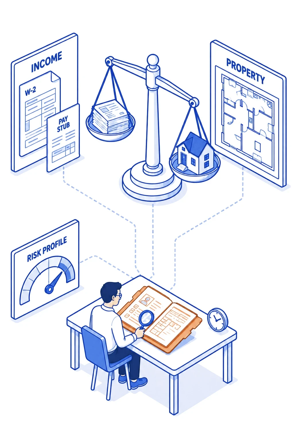
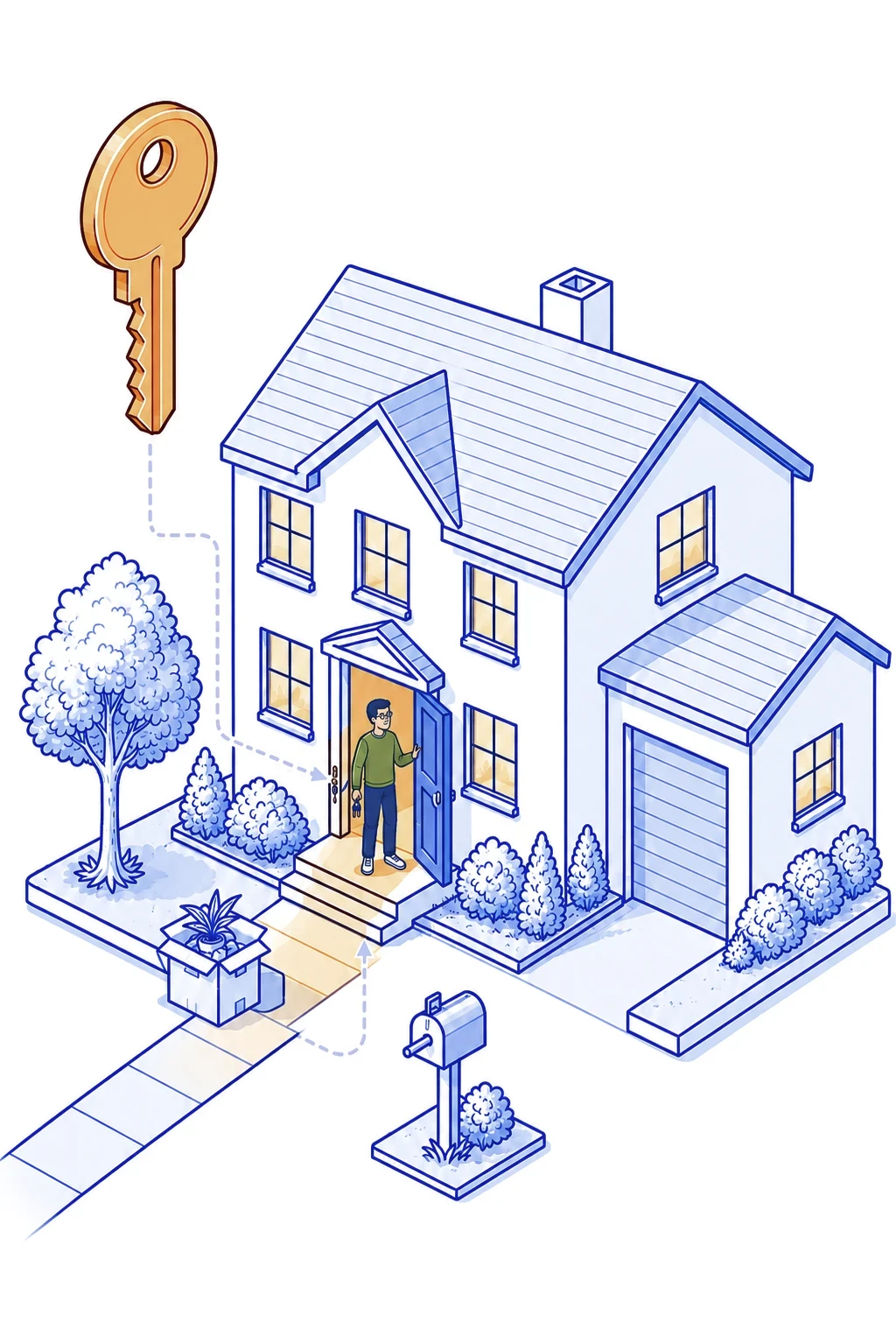
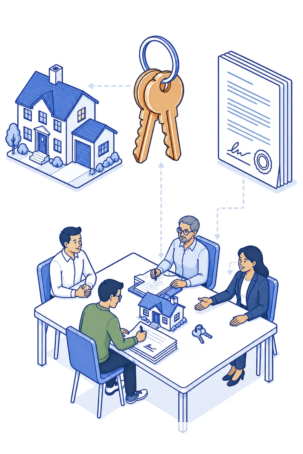
Thompson Kane’s illustrations are isometric: objects and figures arranged on a shared three-dimensional grid, built up like a small architectural model so a single image can hold a whole process. The drawing stays plain on purpose. Shapes are simple and details are few, so the picture reads at a glance, and dashed lines connect related elements to show how the pieces of a process relate. An illustration earns its place in one of two ways: it shows something the text leaves out, or it explains a part of home financing that would take a paragraph to describe, such as how a file moves from application to closing. Color follows the brand. Primary Blue 650 (#008BC2) and Primary Blue 600 (#009DD6) carry the key forms, Neutral 400 (#A8ACB5) carries the supporting structure, and white gives the composition air. When a scene needs one more color to separate its parts, Accent Orange 500 (#F19341) or Accent Green 600 (#44BA58) is added in small amounts. The images here can be saved and used as they are, and they set the standard for anything new: an illustration found or generated for an ad or a social post should look like it belongs to this set.






Prompting AI to Generate On-brand Illustrations
Guide
To generate a new illustration, start from one of these prompts, replace the bracketed subject, and attach an image from this set as a style reference. Check the result against the set before it goes out.
Prompting AI to Generate On-brand Illustrations
Guide
To generate a new illustration, start from one of these prompts, replace the bracketed subject, and attach an image from this set as a style reference. Check the result against the set before it goes out.

Process scene
Isometric line-art illustration on a clean white background. Subject: [e.g. a loan officer and a borrower reviewing a loan estimate at a desk, with a floating calculator panel above the subjects to the left and a house model above to the right, both connected to the people by dashed lines].
Style: consistent 30-degree isometric angle; bold, even outlines; flat color fills with no gradients or texture; simple geometric figures with minimal facial detail; objects arranged as a small architectural assemblage, with dashed lines connecting related elements.
Color: outlines and key forms in #008BC2 and #009DD6, supporting surfaces in #A8ACB5, white highlights, one small accent in #F19341. Match the style of the attached image.
No text, letters, numbers, or logos anywhere in the image. Every element fully inside the frame, nothing cropped. Square format.

Single-idea icon
Flat isometric icon on a clean white background.
Subject: [a Cape Cod-style house with 2 simple dormers, with a slot along the roofline that makes it become a savings bank. A coin dropping into the slot. The house is a classic Cape Cod: one and a half stories, a simple rectangular footprint wider than it is deep, and a steep side-gabled roof whose ridge runs parallel to the front of the house, with low eaves and a crisp roof edge. A single simple chimney rises from the center of the ridge. The front has a centered door flanked by one window on each side, all plain flat rectangles with no panes, trim, or shutters. No dormers, no porch, no wings or additions. A single bold coin slot sits on the front roof plane, and one coin falls toward it from above. Above the coin, three short, thick, motion strokes run parallel to its path, each nearly as thick as the coin's edge, evenly spaced.
Style: one key object, centered, with generous empty margin on all sides; consistent 30-degree isometric angle; solid flat fills, no outlines, no gradients, minimal to no texture, one soft shadow at the base. Designed for typical use at 150 to 300 pixels wide, with enough detail to look finished at that size, yet still legible if reduced to 80 pixels: the house silhouette, the coin, and the motion strokes must survive that reduction, and no essential shape may depend on a line thinner than about one-fortieth of the image width.
Color: front wall in #009DD6, gable end walls in #008BC2, roof planes in #A8ACB5, chimney in #A8ACB5, the coin slot in #008BC2, door and windows in white, the coin in #F19341, motion strokes in #A8ACB5, white for small highlights only.
No ground plane, no scenery, no figures, no dashed lines, no secondary objects. No text, letters, numbers, symbols, or logos anywhere, including on the coin. Use the attached image for color and rendering style only; do not copy its objects or composition. Nothing cropped. Square format.





Photography
Photo Standards
Thompson Kane Brand Foundations redesign - Claude
Photography
Standards
Thompson Kane Brand Foundations redesign - Claude

Daylight
Daylight. Shoot near a window or outdoors in open shade. Keep the frame bright and the shadows soft, and turn off the flash.

Room to Crop
Shoot horizontal and a little wider than needed, so the image can be cropped for the web or a social post and oriented either vertically or horizontally. Keep the horizon level.

Name the Moment
Before shooting, name the one moment that belongs to the subject alone. For a cash offer program, that moment is the call saying the offer was accepted; a moving box could illustrate any mortgage.

Two Details
Realism can emerge with one or two specific personal objects: a phone face down, a blurred cat jumping off a chair. More than that turns into clutter, and fewer leaves the room looking staged.

One Look
White balance neutral to slightly cool: a white wall reads white or faintly blue-grey, never cream. Exposure bright enough that faces glow but whites keep their texture, shadows open, color restrained with no warm cast. Grain and vignettes stay out.
One Look
White balance neutral to slightly cool: a white wall reads white or faintly blue-grey, never cream. Exposure bright enough that faces glow but whites keep their texture, shadows open, color restrained with no warm cast. Grain and vignettes stay out.

Permissions
Anyone recognizable signs a photo release for images taken in-house. A borrower’s home is photographed only with the owner’s permission. Review terms of stock images, and confirm model releases are in place. Redact house numbers and license plates.
Briefing a Photographer
Thompson Kane Brand Foundations redesign - Claude
Briefing a Photographer
Thompson Kane Brand Foundations redesign - Claude
Send this page and three approved reference images from it with every booking. The references do more than any written description.
Alternatives
01 THE LOOK
White balance
Set a custom white balance on location. Whites read clean, and skin stays natural.
Exposure
Bright and even. A white shirt keeps its texture, and the darkest part of a face keeps detail.
Contrast
Moderate, with crisp midtones and no crushed blacks or faded, matte shadows.
Color
Restrained. Pull down the yellows and oranges in floors, furniture, and lamps without touching skin. Blues and greys stay clean.
Finish
Natural sharpness. No grain, vignettes, HDR effects, or film looks.

02 OFFICE PORTRAITS
Light
Use window light as the key, with the subject turned about 45 degrees toward the glass. Switch off overhead fluorescents to avoid mixed light and green casts. If more light is needed, use one large soft source balanced to daylight, never direct on-camera flash
Background
Light and uncluttered, with real office context softly out of focus (around f/2.8 to f/4). Clear away cords, clutter, and anything with another company’s logo.
Wardrobe
Solid whites, greys, navy, and soft blues. No large logos or fine stripes.
Direction
For each person, shoot candid working moments (on a call by the window, reviewing a file with a colleague) and one clean portrait looking at the camera with a relaxed, natural expression. Leave out crossed arms, handshakes, pointing at screens, and keys.
Framing
Horizontal and vertical versions of each setup, with open space on one side for type.
03 HOMES & NEIGHBORHOODS
Light
Shoot mid-morning to early afternoon in sun through light cloud or open shade. Avoid golden hour.
Camera
At standing eye level, with verticals straight and the horizon level, and room around the house to crop.
Frame
Keep house numbers, license plates, and unreleased faces out of frame, and get the owner’s permission before shooting.
04 DELIVERY
Approval first
Send a small set of edited selects for approval before editing the full shoot.
Files
Full-resolution JPEGs in sRGB, at least 3000 pixels on the long side, all with the same edit.
Retouching
Limited to blemishes and stray hairs. Skin texture stays, and faces are never altered with AI.